.jpg)
TAKOWEAR
E-COMMERCE STORE DESIGN
Building a Strong D2C Shop Requires a Combination of
Strategy
Data-oriented informed decision making
Creativity
Crafting a unique identity valuable to target audience
Consistency
Consistent communication across all channels
To develop the right brand strategy to hit our target of 5 sales daily, we researched -
-
Current online shops of competitors
-
Social media content published
by competitors
Data Comparison of Competitors
-
For large companies, social media is a small percentage
-
Percentage of social media increases with medium and small companies. (FB marketing a major driver)
-
Organic search is high in medium companies (SEO and Blog focus)
-
Direct traffic is due to brand recall typically (Insta a major driver)
-
Paid search (Google ads) typically
works best with niche products
(lesser competition)
A look at how competitors approach the 3 critical pillars to creating a successful shop
Shop Experience
Brand Awareness
Performance Marketing
A Great Interface with
Exciting Designs/Products
Souled Store - categories + appropriate filters for massive collections, multiple images at checkout
Bewakoof - powerful
hero banner and categorization of
clothing options, featuring products
on homepage
Redwolf - linking multiple products with same design to each other, categorizing designs on characters, featuring products on homepage,
pop culture related designs
Otaku Culture - SEO friendly pages, focusing on just a single niche of animes
Feranoid - discount coupons and sales rampant on the site to create some sense of FOMO
Ulty Khopdi - landing page-esque
content, with login and profile page
Osom - amazing pop culture related t-shirt designs, focus on SEO with blog posts and articles
Yo Aatma - CTA
to subscribe
Redwolf - use of brand colors
Bewakoof - occasional memes and other topical content, only short form videos on YouTube
Souled Store - reused content across platforms, photoshoots
of models and collections
Souled Store Insta 1
Souled Store Insta 2
Souled Store Insta 3
Souled Store YouTube
Feranoid, Otaku and Osom - smaller brands focusing on mainly product images
Yo Aatma - contests to give discounts and usage of AI art
to create posts
Ulty Khopdi - posts of direct designs along with models allowing for multiple posts of same designs
Use of actual people in daily settings, wearing the brand
Spreading the Word
across Multiple Channels
Understanding the User
Demographics/Search Intent
The primary demographic for similar brands are men (65.12%), predominantly within the 18-34 age range, combining for over 70% of their user base.
The search data suggests that most people aren't actively looking for t-shirt designs, especially wildlife and travel related. Viral videos and ads can help change the trend though.
Content Marketing
Strategies and Performance
Audiences of a younger age group tend to spend more time on Instagram, whereas older audience prefers Facebook. Additionally, tier-2 audience prefers Facebook, making it a better platform to market on. Knowing exactly who the target audience is and how we need to reach out to them will help plan the necessary strategy to meet the sales target.
Depending on which platform we leverage for ads (Facebook, Instagram, Google) -
1. ROAS: Aim will be to be above 2
2. CTR: Average 1-5% across channels
3. Conversion Rate: 2-5% for website visitors, potentially higher for specific campaigns
4. CLTV: Prioritize lifetime value through repeat purchases
Additionally, the designs needs to include pop culture, music, witty memes/quotes and other trending topics for better conversion.
General Information
and Asset Usage
The following colors need to be used in the mentioned ratios across all collaterals -
Keeping in mind the logo and the octopus theme, assets in general should follow similar waviness and playfulness across creatives -
Logo and Palette
Background Themes
The following is a moodboard to give an idea of the themes and emotions the collaterals need to represent -
The following are some icons to display the treatment that needs to be followed (for highlights and stories) -
Design of the Month | News | Events
Giveaways | Contact Us | New Arrivals
Permanent Marker
Font sizes 45 / 50
Used for titles
Kodchasan
Font sizes 45 / 50
Used for texts
Bold for CTAs
(Closest to Grover on Canva)
Icons and Typography
Instagram Calendar
and Pattern
Scheduling Posts
Across every 9 posts -
4 product showcase carousels
40-50% of posts that actually show the products in action
2 quote carousels
Engagement posts to connect to the community
2 meme images
Engagement posts that can help gain traction
1 brand image
Information based posts about announcements, discounts, and brand scoop
The following backgrounds could be used for each individual post, so that across multiple tiles, there is fluidity and constant brand recall from post to post -
Extended Branding
Safe margins are 1080x1080 (to optimize for
the profile page)
but the image, carousel, or reel itself should be 1080x1350 for
best usage of
real estate
Main content goes here
Beyond the margins is for the logo, site URL, and handle
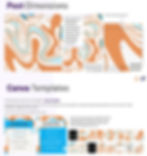
Post Dimensions
Canva Templates
The following is the link to the template - Canva Template
Duplicate the file each time, use the correct first image as per the calendar, and drag the appropriate elements onto the file to create carousels, images, and reel covers.
Pick from any of the pre-decided CTAs only
Instructions have been provided inside the template link with respect to how to use each template, where the texts go, and where the images have to go
Product Showcase (Carousels)
Memes (Images)
Quotes and Texts (Carousels)
Life may begin at 30, but it doesn't get interesting until about 75 mph.
Some call it adventure, we call it life.
A long ride is the answer to a question you will soon forget.
A hundred years from now, my great-grandkids will not recall my bank balance, the sort of house I lived in, but they will remember I rode a motorcycle.
You know, Motorcycle Diaries has no incredible stories, no sudden plot twists. It doesn’t play that way. It’s about recognizing the instance of change and embracing it.
Brand Display (Images)
At Takowear, we believe in embracing the twists and turns of the road, just like the fluid grace of our eight-armed mascot!
Octopuses are masters of camouflage, blending seamlessly with their surroundings. Similarly, our biker tees let you blend your love for nature and riding with unbeatable style.
Why an octopus for Takowear? Because, like our biker prints, they're not afraid to stand out! With eight arms full of attitude, our tees redefine what it means to make a statement.
Takowear's octopus logo isn't just about embracing the depths of the ocean; it's a symbol of embracing the depth of your biker spirit and love for nature. Dive into style with Takowear!
Octopuses are masters of multi-tasking with their eight arms. Similarly, our tees multitask as the perfect canvas for both biker and nature enthusiasts – wear your passion, whatever the ride!
Profile Page
Based on the discussed guidelines, the page stands to look something as shown, forming an extended mosaic, with importance on -
Product showcase
Community building
Brand awareness
Folder Link
Takowear is a clothing and apparels brand that sells t-shirts, caps, and hoodies, with designs that appeal to a very specific niche of bikers and travel enthusiasts. The expectation was to completely revamp the brand’s e-commerce Shopify website, and create a social media brand guidelines system for easy creation of Instagram content.
The idea was to first do an audit of the brand and analyze what other competitors in the space were doing, so that a clear plan of action could be jotted down.
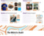
The following are some screens from an extensive document of the same, with screengrabs of best practices of other brands and their social media strategies, along with their overall performance -
The following are some snippets of th social media guidelines provided, along with the rationale behind the designs. Additionally, easy-to-use templates were also created to create content at scale -
Before starting the revamp of the website, a thorough breakdown was done of the existing flow from a UX perspective, keeping in mind strategies to ensure a seamless customer experience, eventually leading to successful sales. The following are a few snippets of the same -
Here are some screens of the finalized designs -
Addition of Add to Cart and Wishlist
A mega-menu in the top nav bar
Trending designs right on top to drive sales
Sales banner to create incentives for conversions
Product ratings and color swatches
Instagram content to show social media presence
SEO blogs and articles as part of a value-add section
Customer testimonials for social proofing
Different views to showcase products
Pop-ups to generate leads, and drive conversion
Seamless checkout flow, with discounts and information to create a sense of urgency
Let's minimize the height of the top navigation bar. Also the menu needs to be more accessible and visual
First Fold lacks an actionable CTA. To enhance user experience, consider adding a direct option to jump to the shop from the first fold itself, rather than requiring users to scroll to the next fold.
The Hero section could be transformed into an auto-scrollable carousel, allowing users to view a variety of T-shirt designs, instead of just one fixed set.
Global: Revise the website's copy to ensure consistency in letter casing throughout various sections.
More SKUs can be shown in the Home Page. This can be helpful for people wanting to browse the contents of the site without wanting to go too deep in the collections yet.
Some Example SKU Sets to show in the Home page are:
Top Selling / Recommended Picks / Fresh Arrivals
Best Sellers for Each Category
SKU with offers/ Discounts
Below the Hero Section, display the three categories using smaller category icons instead of large cards. This approach offers users a quick understanding of the site's structure at a glance.
Replace the "Collections" heading with a more user-centric term, such as "Shop by Theme" or "Shop by Category," to enhance engagement.
UI: The Card design for the Product card can be cleaned. The dark gray is adding a lot of visual weight and is taking away from the hero image and the title/ pricing of the product.
Incorporate a section on the homepage for Product Features. This could highlight general shipping information, return policy, materials used, or any unique features that distinguish these products.
A section that gives social proof to the customer is required. These can be through Brand Testimonials, User reviews etc.
This can also be used for our social media strategy.
A section can be placed to encourage people joining the newsletter or upcoming offers
Have a section where users can send in there photos wearing your apparel. This drives user engagement/ Trust with your brand.
Global: Make images more accessible. Some images have the same alt text. This affects accessibility and, eventually, conversions.
Global: Meta Title and Meta Description needs to speak the language of the customer otherwise it’s impossible to get SEO rankings and traffic to the website.
Mweb Global: Add a fixed navigation bar for mobile visitors. Mobile visitors may get frustrated or distracted and leave quickly if you don't have a fixed navigation bar for your mobile site.
Global: Enhance your Share link by adding a meta title, thumbnail image, and description. Currently, these elements are not displayed, which affects visibility and engagement.
Let's minimize the height of the top navigation bar. This way, we can display more relevant information within a single view, eliminating the need for scrolling.
In the first fold, consider replacing the bulk of the text with visuals. Users are less likely to read through extensive text, so minimizing or removing it in favor of more engaging visual elements could be more effective.
Filters and sorting options are currently absent. For instance, in the music collection section, you could introduce filters for different music genres to enhance user navigation and experience.
UI: The Card design for the Product card can be cleaned. The dark gray is adding a lot of visual weight and is taking away from the hero image and the title/ pricing of the product.
Add to Bag CTA can be added, to give an exit point for the high intent users to directly checkout.
Give a total Product count of the collection at the top.
Product Rating can be shown on the product cards.
Relevant tags like New Arrivals, Best Sellers etc can be put on the cards. Colour Variations can be shown upfront.
We can have thumbnails of categories in the collection page. This gives users easy access to rest of the categories.
To break monotone of the collections page we can add a banner in the middle. This place can also be used to showcase any offers in the collection.
Let's minimize the height of the top navigation bar. This way, we can display more relevant information within a single view, eliminating the need for scrolling.
Place the 'Buy it Now' and 'Add to Cart' buttons below the Size and Color selection options for a more intuitive shopping experience.
In Mweb, Buy Now + Add to Cart can be a sticky button. This will allow the size and colour options to come up in the fold.
While colour can be preselected, User should be made to select the size to prevent them from accidentally proceeding with the wrong size. In Mweb, this can be done using a Bottom Sheet, when they tap on buy now / Add to cart without selecting the size. (Ref: Nicobar)
For a clearer presentation of the color options, use visual swatches instead of naming the colors, allowing users to better understand the color palette used.
If the colour selected is black, then the Tshirt in the Product images should only display black Tshirts not any other colour.
Critical informations such as size charts, Delivery details, Product Details, Size and Fit Details and Care instructions are missing. (Ref: Nicobar / Andamen)
Product Images: We need to show some different poses for the product to break the visual montone that is created by having all the models facing forward. We should show the back of the Tshirt as well.
Share button can be removed for now/ moved deeper in the fold, as it’s only adding visual clutter.
Description of the product needs to have relevant details to hook the users with the product. This description and Product title also needs to be generated with SEO in mind.
Users might have further queries about the product. A contact us section is required. If not feasible, a FAQ section should be present. Ideally both.
UI: The Card design for the Related Product can be cleaned. The dark gray is adding a lot of visual weight and is taking away from the hero image and the title/ pricing of the product.
User Reviews should be added to give a sense of social proofing that the product is used by other users as well. This will both build trust and increase conversions
While a section like related products is good where it is in the page, the title needs to be more user facing. Titles like Recommended for you/ More from this collection should be explored.
Currently, the user has no motive to sign up the the newsletter. We have to show what value they will get once they do sign up. Example Copy: “Be the first one to know about our latest offers by joining our newsletter”
Currently the same About us section is present across all the pages, which will feel redundant to the users. Instead it can be condensed to a Footer section with an about us link along with other contact information for the user.
A sense of urgency is needed to be created. Why should the user buy it now and not any time else in the future. Sale offers, limited stock, limited time discounts can achieve this.
Adding Video in the SKU Images can be eye catching and also help users visualize the product better.
Connecting Shopify store with google merchant will help surface the products on the shopping tab.
Let's minimize the height of the top navigation bar. This way, we can display more relevant information within a single view, eliminating the need for scrolling.
Cart can come as a sliding drawer instead of a new page so that the user doesn’t need to leave the Product Display page and can directly checkout from the same page itself.
In the Cart Page, we should show “You may also like” or “Recommended Add ons” sections to increase the average order value during checkout.
We should highlight delivery and payment features in the top of the cart. These can include: Return Policy, Delivery by, COD if available etc.
Gifting options should be given to the user. This can be done as a checkbox at the bottom of the cart page or if more detailed options are to be given, then we can have a CTA “Show Gifting options” and we can take the user to a separate page.
We can have an offer where if the user has a certain order value, we give them free shipping.
For Checkout we can use one tap checkout using Shiprocket
Exit Intent Popup: If the user abandons checkout at the last moment, we can give an exit intent popup
.jpg)
.jpg)
.jpg)
.jpg)
.jpg)
.jpg)
.jpg)
.jpg)
.jpg)
.jpg)
.jpg)